Chart from Table is a macro bundled within Table Filter and , Charts & Spreadsheets app. It allows you to generate dynamically updated charts with the capability to instantly switch between columns with different data values.
...
Hover over the table, click the ![]() icon on the top right corner of the table and select the
icon on the top right corner of the table and select the  option.
Select the chart type, select one of the charts suggested. To remove the chart, click the ![]() icon and select the Remove the macro option.
icon and select the Remove the macro option.
Try to play with build a chart based on the sample table below.
| Expand | ||
|---|---|---|
| ||
|
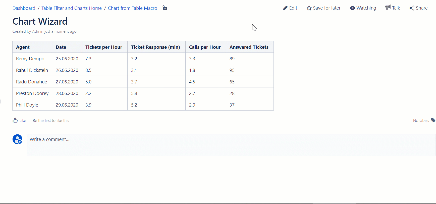
| Agent | Date | Tickets per Hour | Ticket Response (min) | Calls per Hour | Answered TIckets |
|---|---|---|---|---|---|
| Remy Dempo | 25.06.2020 | 7.3 | 3.2 | 3.3 | 89 |
| Rahul Dickstein | 26.06.2020 | 8.5 | 3.1 | 1.8 | 95 |
| Radu Donahue | 27.06.2020 | 5.0 | 3.7 | 4.5 | 65 |
| Preston Doorey | 28.06.2020 | 2.2 | 5.8 | 2.7 | 28 |
| Phill Doyle | 29.06.2020 | 3.9 | 5.2 | 2.9 | 37 |
Chart Examples
Try to see Chart from Table macro in action while working with the following chart examples.
...
| Info | ||
|---|---|---|
| ||
Try to alternate the view of the chart by switching among the following chart types:
You can also select a new column with data values of the following ones:
You can use the Cogwheel |

...
| Info | ||
|---|---|---|
| ||
Try to alternate the view of the chart by switching among the following chart types:
For the Row Labels and Values Column use only table columns containing numbers. You can use the Cogwheel |
...
| Info | ||
|---|---|---|
| ||
Try to alternate the view of the chart by switching among the following chart types:
Alternate the Values Column among the following table columns:
You can use the Cogwheel You can display the trendlines to better understand data movements over the entire time period. |
...
| Info | ||
|---|---|---|
| ||
Try to alternate the view of the chart by adding or removing columns with values for this stacked column chart:
Alternate the view of the chart by switching between the following chart types:
You can use the Cogwheel |
...